About
The Psychology of Colour in Interior Design: How Shades Shape Your Mood
September 3, 2025

Colour is one of the most powerful elements in interior design. Beyond aesthetics, colours can influence how we feel, how we interact with our environment, and even how productive we are. Understanding the psychology of colour can help you design a home that not only looks beautiful but also supports your lifestyle and wellbeing.
1. Warm Colours for Energy and Connection
Shades like red, orange, and yellow are stimulating and energising. They’re great for social spaces like dining rooms and kitchens, where you want to encourage conversation and vibrancy.
Tip: Use these shades as accents (like cushions or wall art) rather than painting entire walls to avoid overwhelming the room.
2. Cool Colours for Calm and Relaxation
Blues and greens evoke feelings of tranquillity and balance. Perfect for bedrooms, bathrooms, or home offices, these shades help create a serene environment where you can unwind or focus.
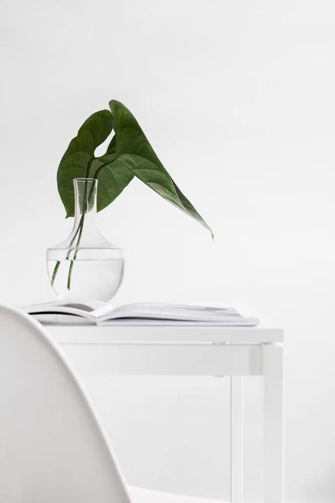
3. Neutral Tones for Timeless Elegance
Beige, taupe, grey, and white provide a sophisticated foundation. Neutrals are versatile, pairing easily with both warm and cool accents while ensuring a clean, cohesive look.
4. Dark Tones for Drama and Sophistication
Charcoal, navy, and deep emerald can make a room feel luxurious and moody. They’re excellent for statement walls, libraries, or dining areas where you want an intimate atmosphere.
5. Pastels for Freshness and Lightness
Soft pinks, lilacs, and mints bring a playful yet subtle charm to spaces. They work especially well in children’s rooms, creative studios, or as gentle accents in minimalist homes.
Conclusion
Colour is more than decoration—it’s a design tool that can transform your mood and enhance your daily life. Whether you’re looking to energise, relax, or impress, choosing the right colours ensures your home feels aligned with your lifestyle.
No items found.


